.png)
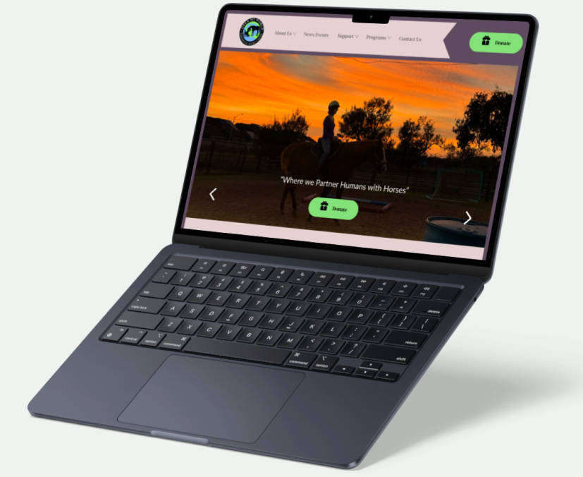
Open My World Therapeutic Riding, a Texas based nonprofit, is dedicated to enriching the lives of children and adults with mental, cognitive, and physical disabilities through the transformative connection between humans and horses.
Roles:
UX Researcher
UI Designer
Team:
Kalina, Priyanka, Soo, & Jeskica
Tools:
Figma, Otter Ai, Canva, Chat GBT
Problem: The project aimed to increase the Non-Profit's visibility and popularity by raising awareness of its programs and services, boosting donations, and addressing key usability concerns such as navigation challenges and inconsistencies in design and content.
Solution: To address these challenges, our solution focused on improving accessibility, enhancing the overall user experience, and expanding outreach efforts. By streamlining navigation and organizing content more effectively, we aimed to make it easier for users to find essential information, engage with services, and support the nonprofit’s mission through increased involvement and donations.
Impact:
More inquiries about equine-assisted therapy and programs
Increase In User Interactions
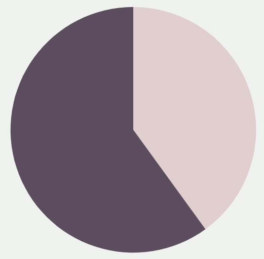
40%
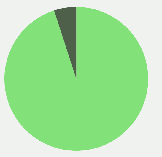
Task Completion Rate
95%
Improved navigation; reduced bounce rate
Research:
What
How
Who
Who
-
Identify barriers preventing users from easily accessing key information on the website
-
Interviews: Five 1:1 interviews
-
We will target to recruit participants within our network
-
Inform a strategic website redesign to better reflect the organization’s goals and support community growth
-
Perform A/B testing
-
Demographics: 30 - 40 years old
-
Analyze navigation issues and content inconsistencies affecting user experience
-
Sample size: 4-5 participants
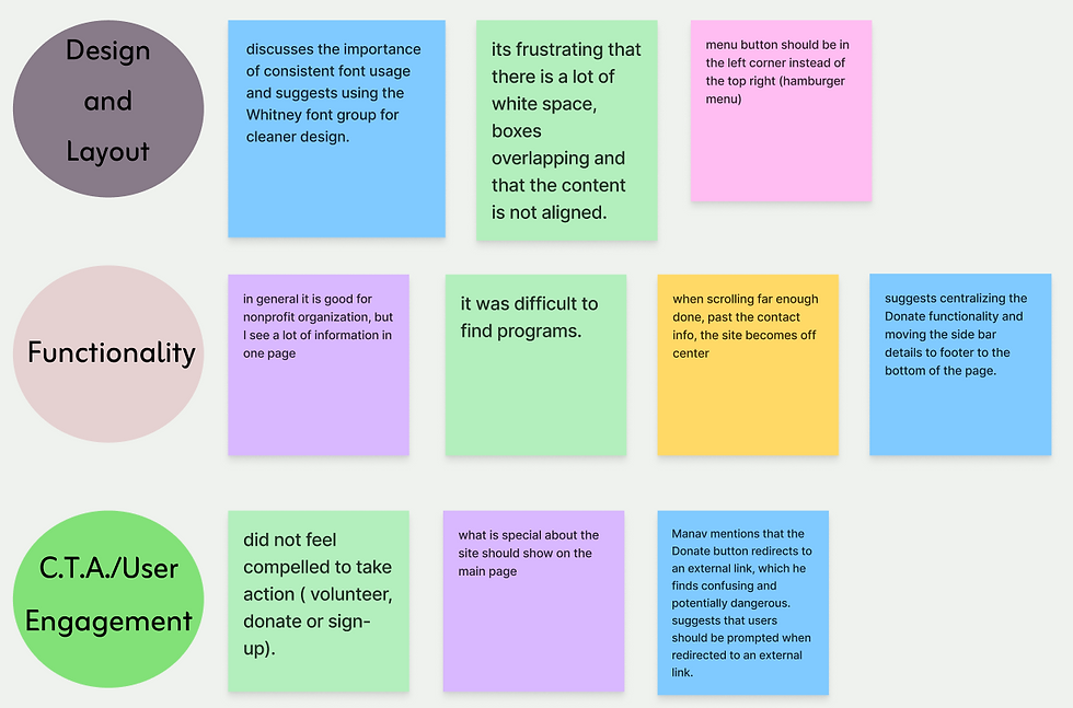
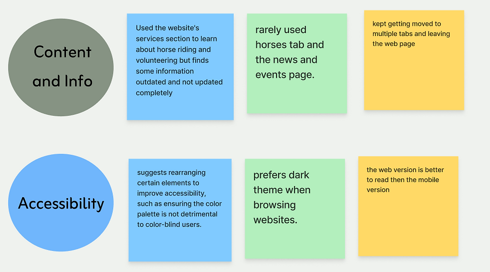
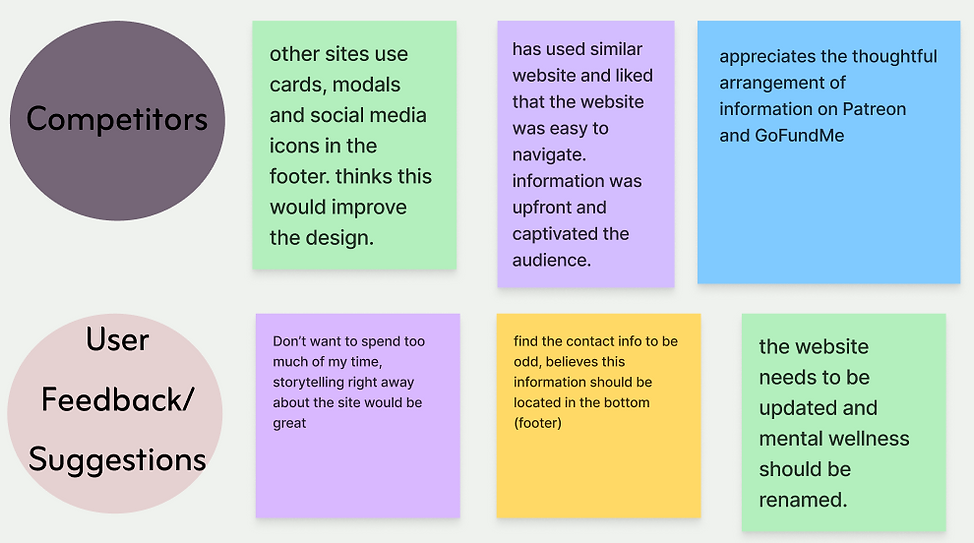
Affinity Diagram: This affinity diagram was developed using insights gathered from user interviews. Key themes and categories were identified to organize the feedback, allowing us to better understand user needs, uncover patterns, and gain a clearer view of the overall experience.
Proto-Persona:
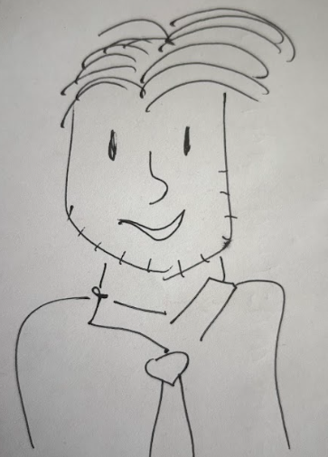
Goals:
-
To be able to know more about helping people with special and different needs.
-
Is interested in Equine Therapy ever since he got to know about it.
-
Wants to volunteer his time for non-profits catered towards children with special needs.
Hank Norman
40 years old
Veterinarian
Austin, Tx
Hank is a veterinarian who wants to volunteer his time with nonprofits that catred towards special needs.
Pain Points:
-
Is often confused whenever he lands on websites and does not know exactly what to do.
-
Wants a smooth interface experience when it comes to options such as donations, sponsorship, and so on.
-
Understanding what exactly is the idea behind a certain organization is while browsing websites
Heuristic Evaluation:
Heuristic evaluation is crucial in website redesigns because it quickly identifies usability issues using proven principles, helping improve user experience before major changes are made.
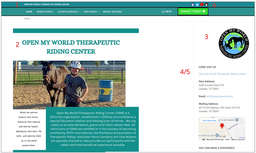
Key:
1. Double Nav Bar with two different shades
4. Side bar information should be moved to footnotes
2. The web page has no real center, alignments are off
5. Font is too small and hard to read
3. Placement of the logo should move, reading left to right instead of right to left
6. Socials should be moved to footnotes
Competitor Analysis:
Competitor analysis is important because it reveals industry standards, highlights strengths and weaknesses in other offerings.
Direct:
Indirect:

-
Clear vision
-
Visual cues and less text
-
Organized page layout
-
Proper and neat containers with well-aligned fonts
-
Well-designed drop-down feature
-
Good use of the visibility heuristic
-
Color scheme, design layout, and use of motion pictures make the website fun and engaging
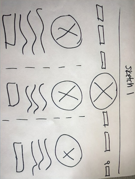
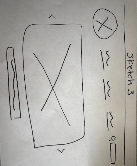
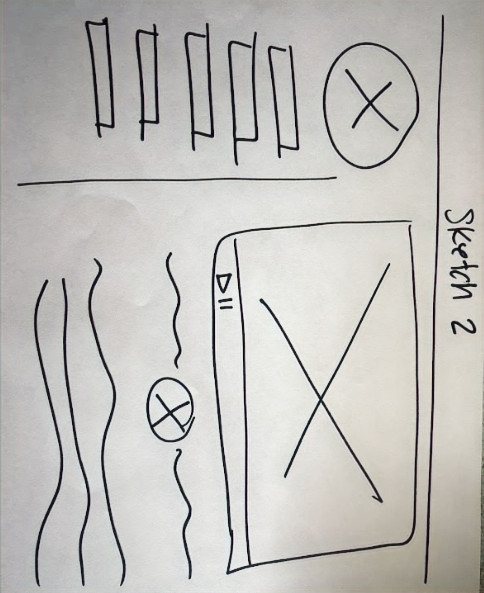
Sketches:
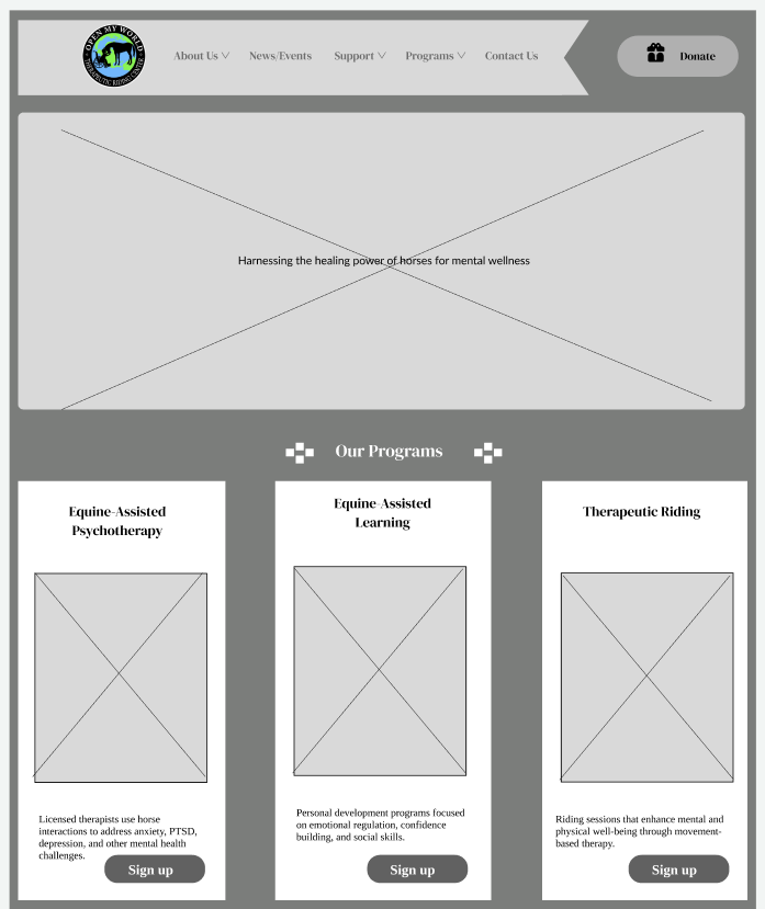
Mid-Fi Wireframes:
Mid-Fi wire frames are a important step in the design process because it focuses on layout, structure, and user flow without getting distracted by visual design details.
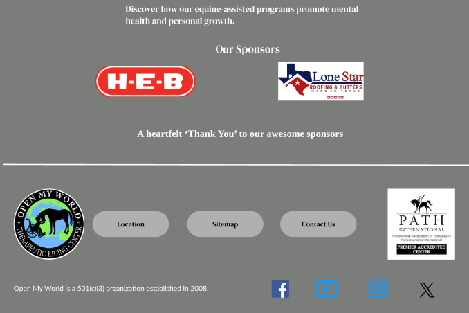
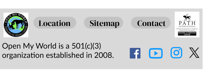
Desktop
Donation Page
Footer
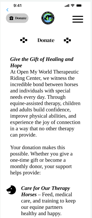
Mobile
Donation Page
Footer
Mid-Fi Iterations:
-
The body text font changed from Tinos to Lato for improved readability.
-
Three distinct font sizes were finalized for both mobile and desktop to ensure consistency and better legibility.
-
Spacing and alignment were adjusted.
-
Interactions were refined to enhance accessibility and ease of navigation.
-
Greater emphasis placed on maintaining consistency.
Mood Board:
The purpose of doing mood boards is that it visually communicate the desired look and feel of a project, helping align the team on tone, style, and branding early in the design process. They serve as inspiration and a reference point to ensure consistency throughout the design.
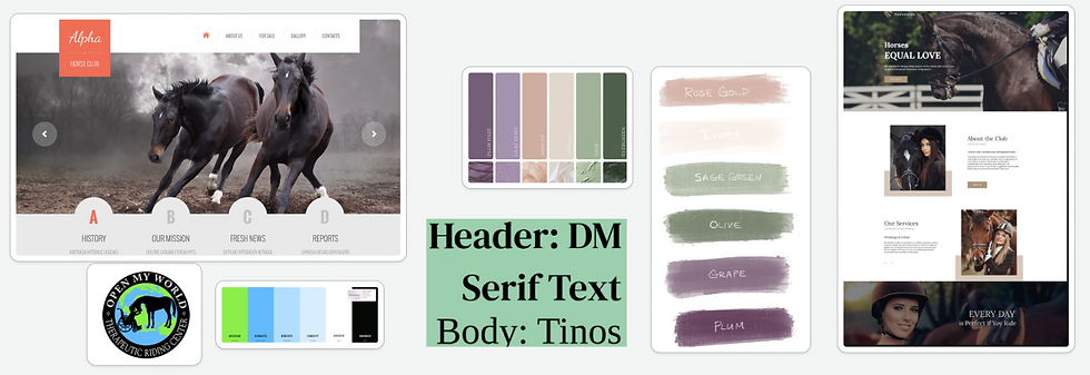
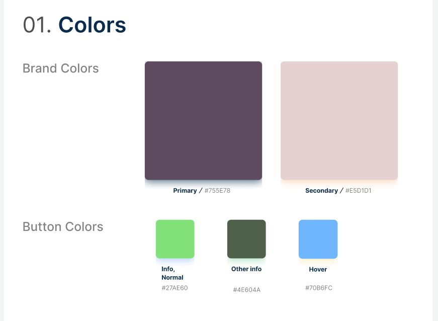
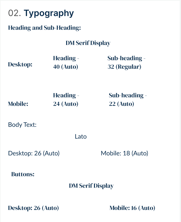
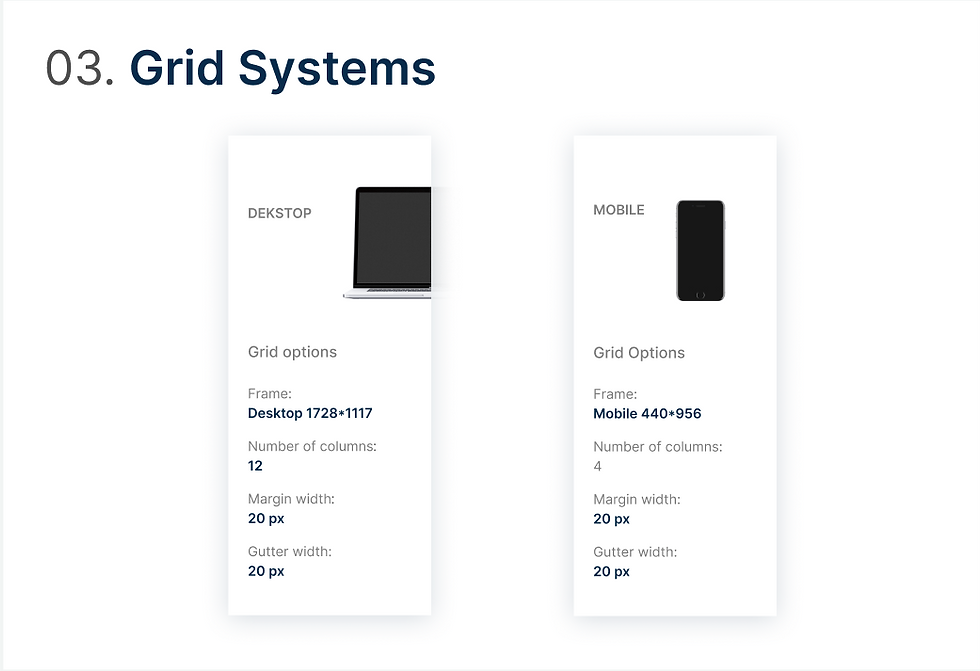
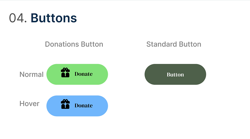
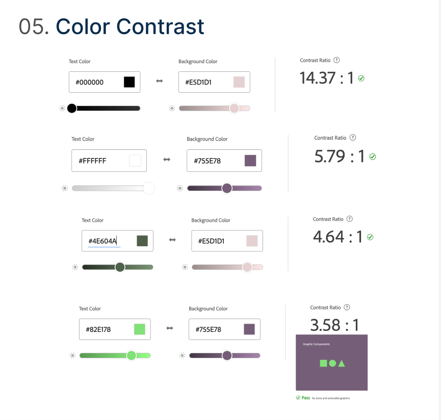
Style Guide:


User Feedback:
-
Appreciated functionality, ease of use, and overall visual appeal
-
Increased interest with more interaction
-
More motivated and engaging experience
Next Steps:
-
Complete and Unify Additional Pages
-
Enhance Usability with Micro-Interactions
-
Iterate based on further User Feedback
-
Strengthen Stakeholder Collaboration
-
Leverage Analytics & Heat maps to get better data

Check Out My Projects

